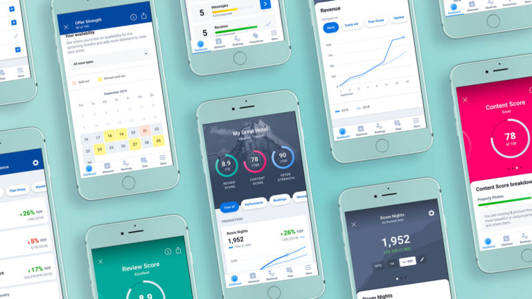
YCS is an enterprise tool where hotels can manage rates and allotment, bookings, promotions and much more. The YCS app was launched early 2018 with a limited set of features. During 2019, we set out to expand on the app and build out some more features.
Our goal with this project was to provide an overview of hotel performance and operations, thus enabling hotels to make better decisions and accelerate their business with Agoda.
BACKGROUND
To get a better understanding on where to focus our efforts, we conducted both qualitative and quantitative research. We sent out surveys to hotels and asked them to rank their most important features. We also travelled to some of our key markets to conduct interviews with hoteliers to get a better understanding of their wants and needs.
When we talked to our users, it became clear that we weren’t providing sufficient insights on how they perform. The most common way for hotels to get insights was in monthly meetings with a Market Manager from Agoda, who would bring a printed monthly report and discuss areas of improvements face-to-face.
While this report was appreciated, it didn’t provide all the data our hotels wanted, and didn’t allow them to customize it the way they needed. By providing a more flexible way to generate these insights, we believe that hotels would be able to make better decisions. And we would also reduce the labour-intensive process of printing reports and visiting hotels.
INITIAL RESEARCH
In order to understand what data our hotels needed and which tasks they normally performed, we had to immerse ourselves into the daily tasks of the hotels and their staff, as well as our Market Managers who provide data to the hotels. We shadowed our staff and took note of the most common tasks they performed during a day, and scheduled hotel visits to understand how they interacted with our systems and what data was most valuable for them.
Not all hotels operate in the same way, and it was important for us to cover as many types of markets, hotels and users as possible on our visits. We targeted specific hotels in our biggest markets from the data of active users on both app and desktop. With the help of local Partner Services teams, we could schedule visits with a diverse set of hotels, from small family-run boutique hotels in Taichung, Taiwan to larger chain hotels in Cebu, Philippines.
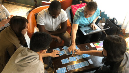
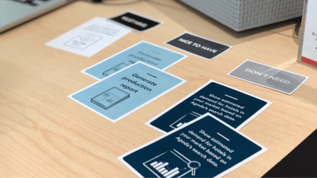
During our hotel visits, we interviewed the staff to understand how and when they used our system. We asked them to rank different features and data by importance, using card sorting.
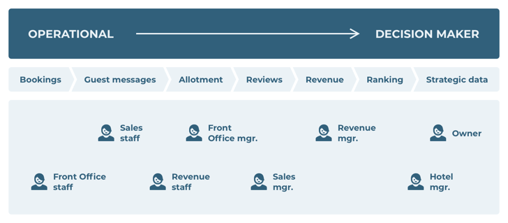
We consolidated the learnings and mapped out the most wanted features across the different types of hotels, markets and roles within hotels. By mapping out feature needs by role, it became clear that different roles have different needs:
For decision makers, it was important to get insights on hotel performance, in order for them to make strategic decisions.
For operational staff, they would like to get a good overview of what’s going on at the hotel.
EXPERIMENT AND MEASURE
We decided to focus on the decision makers because they have a bigger say at the hotel. We weren’t catering to their needs at all at the time, whilst operational staff already had the tools they needed on our website. Providing performance data was going to be a bigger challenge for us, and therefore something we wanted to tackle right away.
GOING FORWARD
After visiting four markets to do our initial research (Thailand, Taiwan, Japan and Philippines) and three markets to validate our designs (Thailand, Malaysia and Singapore), we felt confident enough to move onto the next stage of the project. Now we had to decide on a plan to build and roll out the new features!
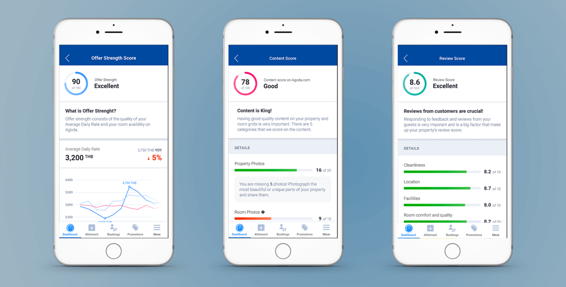
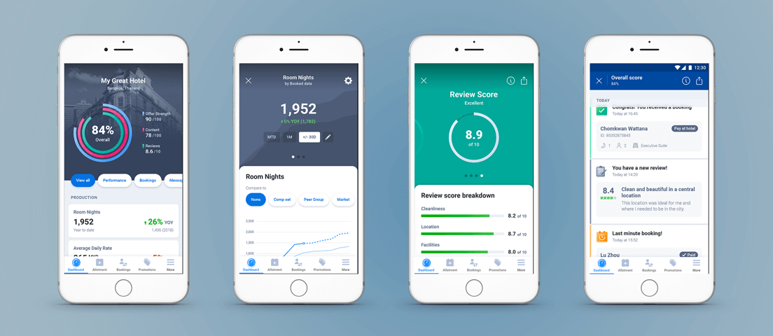
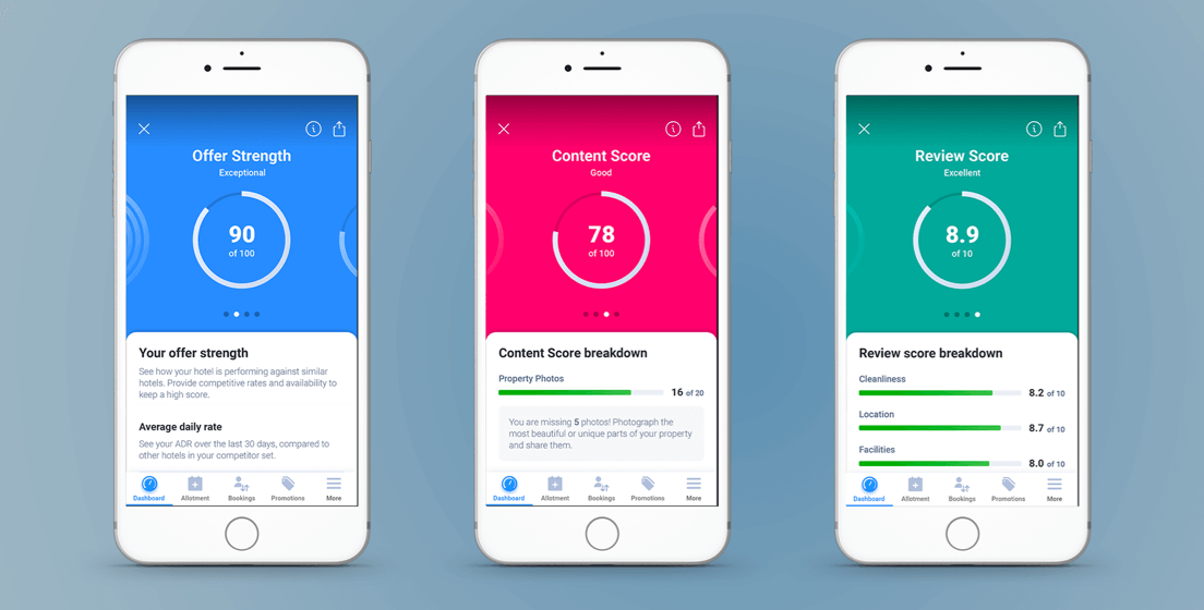
The performance metrics and scores were for the most part new. We had to pull in data analysts and our back-end team to figure out how to calculate scores and generate the data for the hotels.
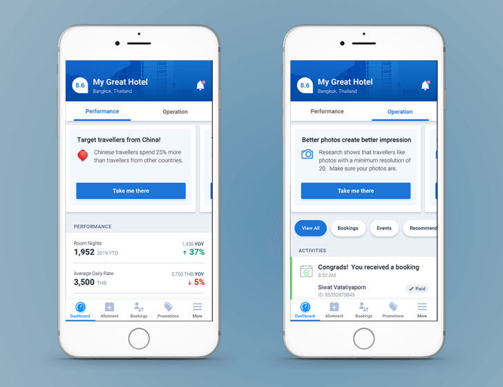
The operations-focused activity feed contained a lot of information that we already displayed on our website, and would therefore be a lot faster to ship. So we decided to roll out these first, whilst also building the back-end logic for the performance metrics and scores.
At the time of writing this, we’re just about to start development of the MVP version.

LEARNINGS
Keeping it real
Moving between different levels of fidelity when designing is key. Low fidelity wireframes work great for quick iterations of different concepts and idea generation. However, when performing usability labs, it proves useful to use a prototype that is as realistic as possible.
Hi-fidelity mockups remove distraction and questions on how the real product would look like and work. Non-designers might have a hard time to imagine how to interact with a product by looking at a set of wireframes.
Allowing real gestures reduces the risk of errors and makes it easier to understand what the user intends to do with the prototype. For example, if you’re designing a UI that affords swiping, make the element swipeable in the prototype.
Use real data whenever possible. We didn’t have enough time to customize the content of our prototype to each hotel, and this caused them to focus on things that we didn’t care about from a design perspective. Despite using the right currency and hotel names, we noticed that some hotels were distracted by certain metrics (“This seems wrong, are these really my rates? Is this really my revenue over the last month or is it quarterly?”). We believe that some aspects of our prototype might have performed better if all the numbers were real, as they would be able to connect the dots quicker and provide feedback on the utility of the designs rather than the accuracy of the numbers.
Optimizing for the right audience
After talking to 15-20 hotels, we noticed that some hoteliers are used to crunching numbers and analyzing their performance regularly and use it as a basis for their business decisions. Others tend to play by ear. In general, the first group would understand how to read the graphs, analyze the numbers and make sense of the prototype. The second group sometimes struggled with abbreviations, legends for graphs and more. We knew we wouldn’t be able to cater to both groups, at least not in the near future, and therefore we had to make a decision – do we cater to the savvier users, or do we simplify it so that everybody can understand it?
When we interviewed the users, we asked them about our competitors and how they use their tools. The less savvy users did not use any of their performance tools today – therefore it’s unlikely that they would use our tool in the future. Based on that we decided to cater to the savvier users.
Alexander Fandén is Senior UX Designer at Agoda.To read his full article, click here.
If you’re passionate about designing great User Experience and make a global impact, join our Design team!